.jpg)
FusionCharts Suite XT는 흥미로운 애니메이션 효과, 스마트한 디자인, 풍부한 대화형 기능 등 업계 최고의 JavaScript 차트를 제공합니다. 더 많은 매출을 올리거나 조직에서 응용 애플리케이션을 채택할 수 있도록 제품에 최적화되고 아름다운 대시 보드를 제공합니다.
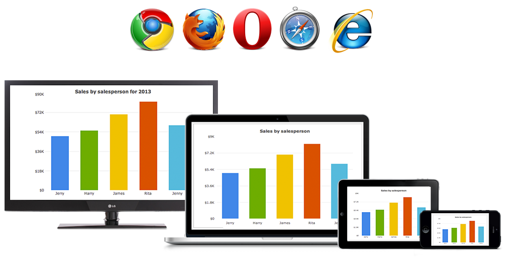
FusionCharts Suite XT는 PC, Mac, iPad, iPhones 또는 Android 기기를 포함한 모든 기기에서 동일한 경험을 제공합니다. 또한 대부분 솔루션이 지원하지 않지만 세계의 5 % 이상이 여전히 사용하는 IE 6, 7 및 8을 포함한 모든 웹 및 모바일 응용 프로그램, 특히 기업 자체 환경에서도 동작합니다. (출처 : w3schools)
FusionCharts Suite XT는 빠르고 효율적입니다. 첫 번째 차트를 생성하는데 15분이라는 시간 밖에 소요되지 않습니다. 또한 무제한 드릴다운, 차트 내보내기, 대화형 범례와 같은 고급 보고기능 내장되어있으므로 회사 내 개발팀에서는 단 몇시간 안에 차트를 완성 할 수 있습니다.
광범위한 JavaScript API를 갖춘 FusionCharts Suite XT는 다른 라이브러리 및 웹 프레임 워크와의 긴밀한 통합을위한 이벤트 및 메소드를 제공합니다. 차트 작성 프로세스의 각 단계를 완벽하게 제어 할 수 있으며, 엔터프라이즈 응용 프로그램을 위한 가장 진보 된 대시 보드를 구축 할 수 있습니다.
FusionCharts Suite XT에는 모든 고급기능에 대한 완전한 API 및 특성정의, 통합예제 및 모든 고급 기능에 대하여 구체적인 설명서가 함께 제공됩니다. 대시보드에서는 실제 비즈니스 사용사례를 시뮬레이션하여 최고의 비즈니스 인사이트를 얻을 수 있습니다. 또한 질문이있는 경우 타사 포럼을 통해 정보를 찾을 필요가 없이 기술 지원 팀에 문의하여 24 시간 이내에 답변을 얻으실 수 있습니다.

광범위한 문서

바로 사용할 수 있는 대시보드
 ㄴ
ㄴ 맞춤형 기술 지원
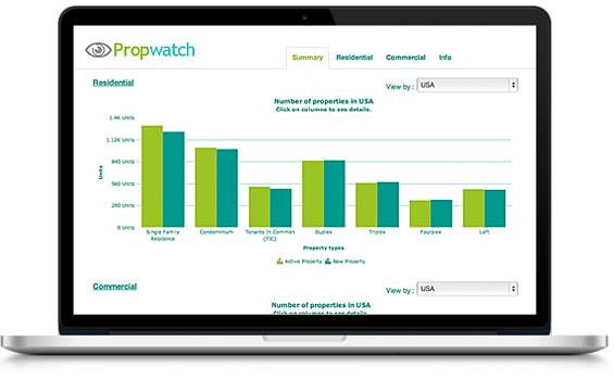
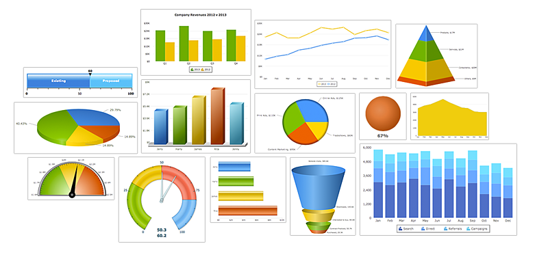
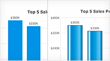
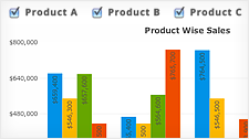
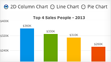
많은 회사에서 사용 중인 차트 솔루션이 고급 구성을 지원하지 않기 때문에 기본 차트만을 사용하여 표현하는 경우가 많습니다. 그러나 잘못된 차트 유형은 잘못된 분석으로 이어지며 이는 잘못된 비즈니스 의사결정으로 이어집니다. FusionCharts Suite XT는 기본 차트에서부터 Funnel 차트, 히트 맵, 확대 / 축소 선, 다중 축 및 Treemap 차트에 이르기까지 90 가지 이상의 차트와 그래프를 제공합니다. 그렇기 때문에 언제나 적절한 유형으로 차트로 표현 할 수 있으며 이는 항상 올바른 비즈니스 방향을 제시합니다
데이터 시각화 솔루션 관련하여, 1인 기업에서부터 Fortune 500 대 기업, 정부 기관, 세계 유수의 은행, 조직 및 사람들에 이르기까지 세계는 데이터 시각화에 관해서 FusionCharts를 신뢰합니다.
우리는 2002 년에 대화 형 차트 작성 방식을 개척했으며 오늘날에는 데이터 시각화만을 구현하고 연구하는 60여개의 팀을 보유하고 있습니다. 데이터 시각화는 우리가 하는 많은 일 중 하나가 아니라, 우리가 하고 관심을 갖는 것은 유일한 것입니다.
만약 귀사에서 데이터 시각화 요구 사항에 맞게 FusionCharts Suite XT의 선택에 대해 절대로 후회하지 않을 것입니다.
FusionCharts Suite XT에는 모든 차트의 미적 및 동작을 완벽하게 제어 할 수있는 강력한 기능이 포함되어 있습니다. 또한 각 차트의 JavaScript API는 클라이언트 측 데이터 업데이트, 개별 매개 변수 업데이트, 차트를 이미지 또는 PDF로 내보내기, 다중 레벨 드릴 다운과 같은 훨씬 더 많은 기능을 제공합니다.
이 섹션을 통해 각 기능을 개별적으로 확인하고 기본 코드를 확인하며 구현 모범 사례를 익힐 수 있습니다. 이에 대한 자세한 내용을 보려면 아래에서 해당하는 기능을 참조하십시오.
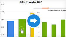
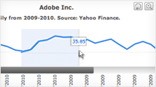
LinkedCharts for Easy Drill-Down
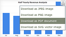
Exporting as Images/PDF
Interactive Zooming & Scrolling
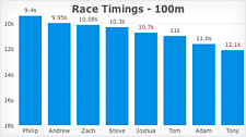
Intelligent Label Management
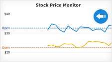
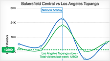
Real-time Charts and Gauges
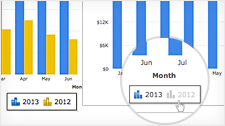
Interactive Legend
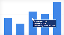
Informative Tooltips
Formatted Numbers
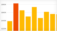
Highlight Data Points
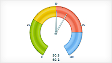
Visually Editable Gauges
Glass Effect on Chart
Multi-Lingual Charts
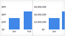
Client-Side Data Update
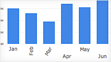
Dynamic Chart Switching
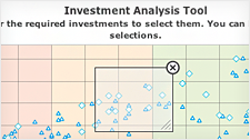
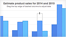
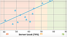
Visual Selection of Data
Macros to effortlessly configure information to display
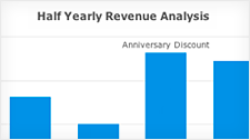
Custom Display Values using Annotations
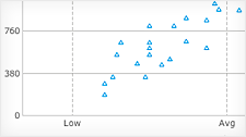
X-Axis Label Modes for Bubble and Scatter Chart
Trendlines
Dynamic resizing of image annotations
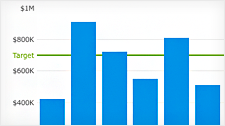
Visually Editable Charts
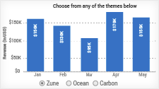
Theme Manager
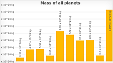
Log Axis Charts
Inverse Axis Charts
Regression Line
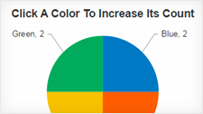
Chart Event Handling
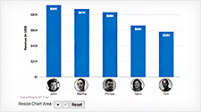
Personalizing the Chart