.jpg)
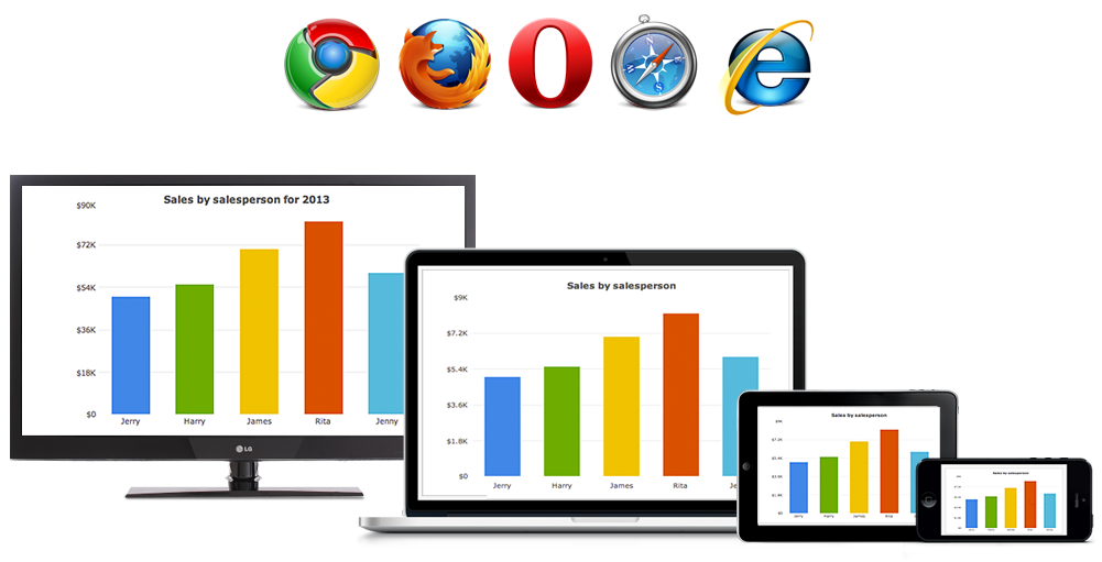
우리는 방대한 더 많은 데이터에 접속할 수 있는 상태지만, 수많은 데이터에서 효과적으로 인사이트를 획득하는 능력은 감소하고 있습니다. 정보의 홍수 속에서 데이터 시각화는 데이터 분석 결과를 차트 솔루션을 통해 쉽게 이해할 수 있도록 시각적으로 표현하고 효과적으로 전달할 수 있습니다.
Last Modified: 2019-11-16 | Topic: 전체
Research has shown that the brain can preserve information much more effectively when provided with visuals compared to written and spoken information. It takes the brain roughly 13 milliseconds to process an image but around 60,000 times as long to process basic text. Over two-thirds (65 percent) of visual information is retained in memory for more than three days compared to 10 to 15 percent recall for spoken or written information.
By using data visualizations, your audience can learn quickly and you can tell an impactful story in a business environment. Although many people are aware of the benefits data visualizations offer, creating effective presentations can be challenging given the sheer quantity of available data and the numerous methods of visualizing it.
This article will arm you with the knowledge to get started visualizing your data and unlocking its potential.
Know Your Story
The explosion of data now makes it easier than ever to back your business story with proof. In business, you always need to be able to effectively justify your idea -- whether you're showing a new concept to your boss or introducing a project to your team. With a variety of data visualization solutions available, you can connect, explore, and turn data into a powerful visual story to influence others in your organization.
It's easy to get lost in this ever-expanding ocean of data, so it is vital that you understand where your data sits and determine the goal of your data visualization from the beginning. The role of visualization solutions is to simplify connecting data points, help you uncover your strongest talking points, and expedite visual storytelling. A valuable approach is also to take on a storytelling mindset. Giving your visualization a narrative offers it a spine and makes it less likely to end up trailing off (along with your audience's attention).
Knowing your story is your first and most important step. If you already have a plan for how you want your story to unfold, you're ready to move to the next step. If not, it's time to start brainstorming. With the amount of data available, you won't struggle to find a source of inspiration.
Know Your Data
Once you know your story, it's time to find the data that supports it. Assess the data at your disposal and look for trends, similarities, or differences. It's important not to rush this stage: make sure the data you're analyzing is relevant, timely, and accurate and that it can mesh with other sources.
Keep it simple. Mixing too many different types or sources of data will only make your work more complicated.
Find the Right Chart Type
Which visualization type is best going to represent your ideas? There are plenty of options, from bar, pie, area, and bubble charts to scatter plots and heat maps.
Your chart selection will depend in part on the patterns or interesting insights you want to communicate. The three common patterns conveyed through data are trends, correlations, and outliers.
Once you've selected the chart type that's right for you, it's time to insert your data and create an appealing and compelling data visualization.
Don't Run Before You Can Walk
Become accustomed to standard data visualizations before you start exploring the world of dashboards. If you have some visualization-building experience, dashboards offer a whole new platform for showcasing your data. The ability to combine multiple views on a single screen facilitates countless possibilities for making connections and highlighting relationships in your data.
Mwav는 FusionCharts와의 업무 협약을 통하여, 다양한 차트 솔루션에 대하여 고객사 비즈니스 환경에 맞추어서 제공 가능합니다.
제품 및 기타 문의사항이 있으신 경우 당사 고객센터 관련 문의 부탁드리겠습니다.
■바로가기 : 당사 홈페이지 > ITProducts > FusionCharts
This story, "Top Techniques for Storytelling with Data" was originally published by Casey McGuigan.